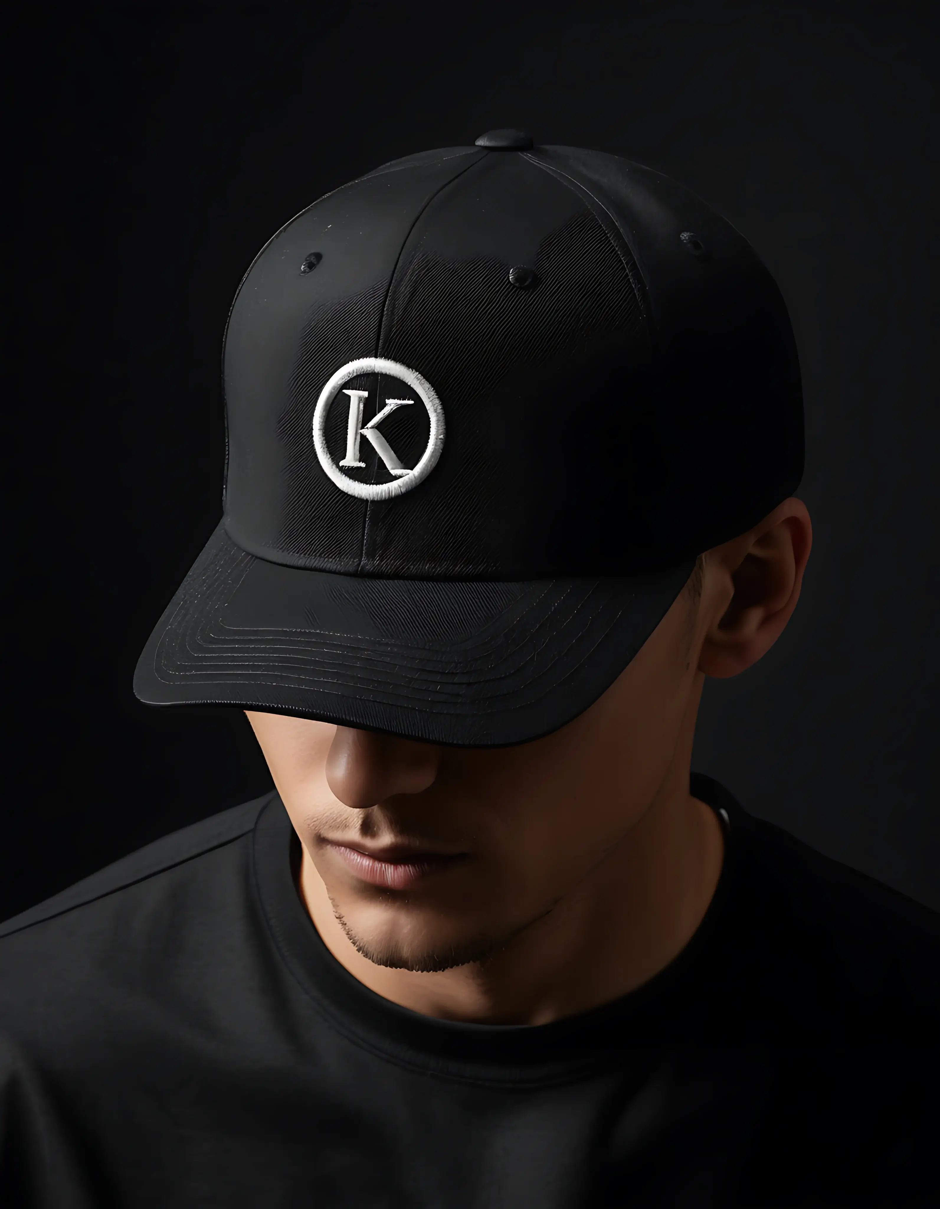
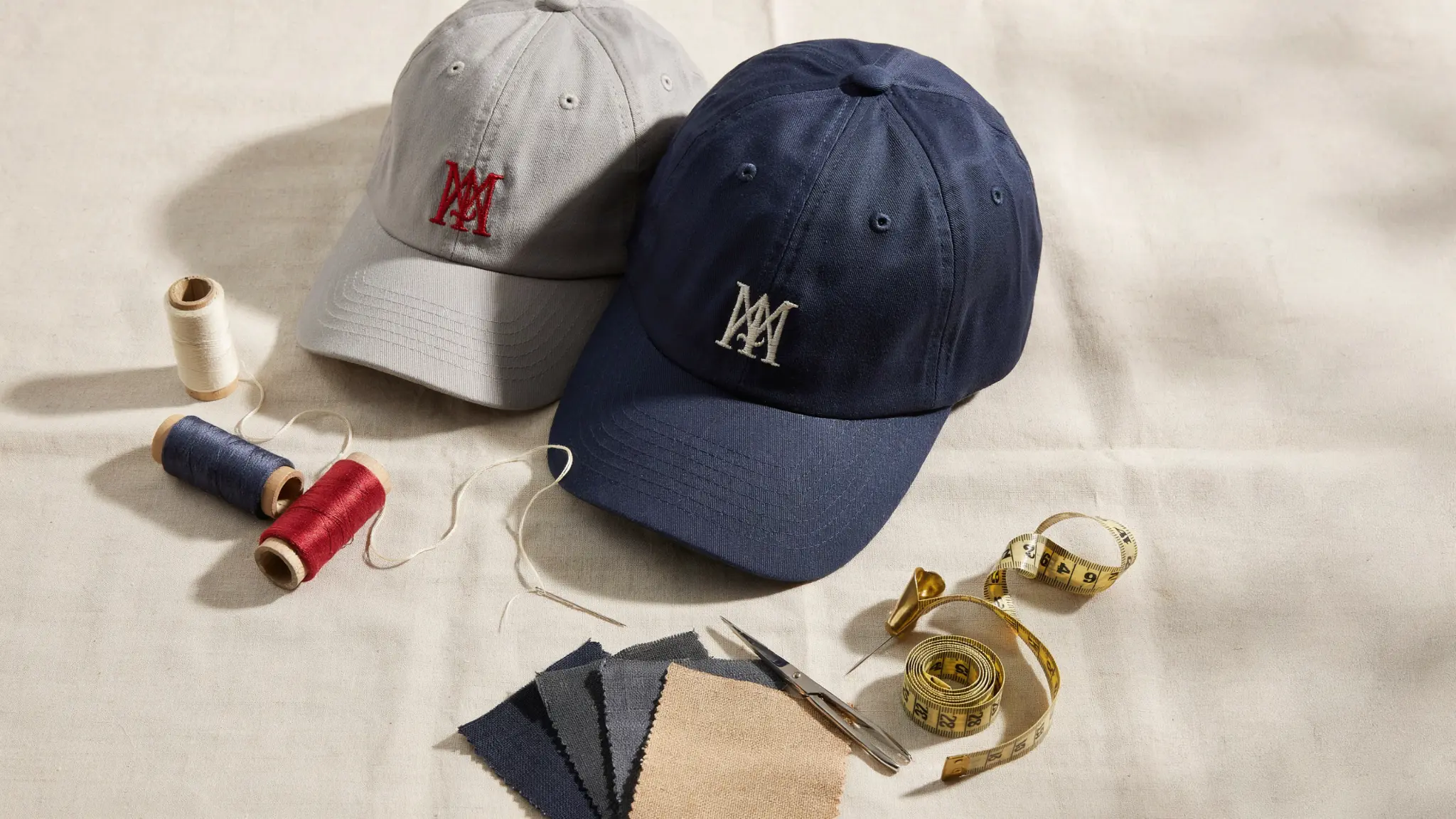
A baseball cap is one of the few pieces of branded merchandise that people choose to wear again and again, on their own time, for free. It sits at eye level in every photo, every school run, and every weekend errand, which is exactly why so many businesses want to design custom baseball caps that actually represent their brand well rather than looking like an afterthought.
The problem is that most guides jump straight to logos and colours without explaining the groundwork that makes a cap design look professional in the first place.
This guide walks through every stage of designing a custom baseball cap for a brand, from understanding cap anatomy and choosing a structure, to logo placement, decoration methods, fabric choices, and the sampling process.
Whether you are outfitting a small café team, launching a streetwear label, or ordering corporate headwear for an entire company, the steps below will help you avoid the common mistakes that make branded caps look cheap and instead produce something your customers or staff will genuinely want to wear.
Why Custom Baseball Caps Are a Smart Branding Investment
Caps travel further than almost any other promotional item because they leave the building on someone’s head rather than sitting in a drawer. A well-designed custom baseball cap builds quiet, repeated brand exposure across gyms, high streets, festivals, and social media without ever feeling like an advertisement.
Compared with printed t-shirts or tote bags, caps also have a longer wear life, hold their shape, and photograph well for social content, which is why so many hospitality groups, sports clubs, and retail brands treat
- Front-facing brand recall: the logo sits directly at eye level in conversations and photos.
- Low cost per impression compared with digital ads over the cap’s lifespan.
- Versatility across uniforms, retail merch, giveaways, and corporate gifting.
- Strong resale and secondhand visibility once staff or customers move on.
Understanding Baseball Cap Anatomy Before You Design
Every design decision, from where a logo sits to how much detail it can hold, depends on the physical structure of the cap. Before opening any design software, it helps to know the parts you are actually designing for.
| Cap Part | What It Is | Why It Matters for Design |
|---|---|---|
| Crown | The rounded top made of 5 or 6 panels | Determines how much curvature your logo artwork needs to follow |
| Front panels | The two panels directly above the brim | Prime real estate for the main logo; most visible in photos |
| Side panels | Panels above each ear | Good for a secondary mark, small wordmark, or website handle |
| Back panel | Rear panel, often adjustable | Suited to taglines, dates, or a smaller repeated logo |
| Brim (peak) | The curved or flat front piece | Can carry embroidery, but sun exposure fades prints faster here |
| Eyelets | Small holes for ventilation | Avoid placing fine detail too close, as stitching can distort |
| Closure | Snapback, strapback, fitted, or Velcro | Affects sizing runs and how uniform the cap looks across a team |
Step 1: Define Your Brand Goals and Audience Before You Design
Skipping this step is the single biggest reason branded caps end up looking generic. A cap for a boutique coffee roastery needs a different design language than one for a construction crew or a music festival.
Before sketching anything, get clear on three things: who will actually wear the cap, where they will wear it, and what single impression you want people to take away in under two seconds. A cap trying to say five things at once usually says nothing memorably.
It also helps to decide whether the cap is meant for internal use (staff uniforms), external use (retail or merchandise), or gifting (client or event giveaways), since each purpose has a different budget ceiling and a different tolerance for bold branding versus subtlety.
Step 2: Choose the Right Cap Style and Fit
The silhouette of the cap is a design decision in itself, not just a sizing choice. A structured cap with a stiff front panel gives a sharper, more corporate look and holds embroidery detail cleanly, while an unstructured cap sits lower and softer for a more relaxed, streetwear feel.
Caps Maker UK produces several base styles worth comparing before you commit to artwork, including snapback caps for an adjustable, street-ready fit, and fitted caps for teams that want a precise, uniform silhouette across every size run.
| Style | Best For | Design Consideration |
|---|---|---|
| Structured 6-panel | Corporate wear, sports teams | Front panel sits upright, ideal for bold central logos |
| Unstructured | Streetwear, casual retail | Softer crown, logo can sit slightly lower and looser |
| Snapback | Youth brands, festivals, giveaways | Flat brim trend pairs well with large graphic logos |
| Fitted | Uniform teams, premium retail | No adjuster, so sizing accuracy matters more than design |
| Trucker style | Outdoor, hospitality, events | Mesh back limits back-panel branding to front and side |
Step 3: Select Fabric, Panel Colour, and Palette
Cotton twill is the most common fabric for branded caps because it holds embroidery well and looks smart in both structured and unstructured builds. Brushed cotton gives a softer, vintage finish, while performance fabrics such as polyester mesh suit sports and outdoor brands that need breathability.
Whatever fabric you choose, keep your palette to two or three colours maximum. Cap embroidery and print both lose clarity fast once a design is packed with more than three colours at this scale, and simpler palettes also keep production costs and reorder consistency easier to manage.
If your brand uses a gradient or a photographic logo, plan a simplified, flat-colour version specifically for headwear rather than forcing the full-detail version onto a small curved surface.
Step 4: Choose a Decoration Method: Embroidery, Print, or Patch
This is the decision that most affects how premium the finished cap looks and feels between embroidered caps vs printed caps or custom patch caps. Embroidery remains the industry standard for branded baseball caps because thread sits raised off the fabric, holds up to years of wear and washing, and reads as more premium than flat print.
Screen printing and heat transfer are cheaper for very fine detail or full-colour photographic logos but fade and crack faster with repeated wear.
A closer breakdown of how these two methods compare in cost, durability, and finish is covered in, which is worth reading before finalising your artwork file, since the method you choose will affect how you prepare your logo.
| Method | Durability | Best Logo Type | Typical Feel |
|---|---|---|---|
| Embroidery | Very high, years of wear | Simple logos, wordmarks, low detail counts | Premium, textured |
| Screen print | Moderate, fades over time | Bold flat-colour graphics | Casual, budget-friendly |
| Heat transfer / vinyl | Lower, can crack or peel | Photographic or gradient logos | Flexible but less durable |
| Woven or embroidered patch | Very high | Detailed emblems, crests, badges | Bold, dimensional |
If your brand mark is highly detailed, such as a crest, mascot, or multi-colour emblem, a woven or embroidered patch applied to the front panel often reproduces the design far more accurately than direct stitching can.
Step 5: Get Logo Placement and Sizing Right
Placement changes how a design is perceived just as much as the artwork itself. The front panel is the default choice for a primary logo because it is the first thing anyone sees, but side and back panels can carry secondary information without competing for attention.
| Placement | Recommended Use | Typical Size |
|---|---|---|
| Front centre panel | Primary logo or wordmark | Approx. 3″ wide x 2.5″ tall |
| Side panel | Secondary icon, small wordmark, or website handle | Approx. 1.5″ wide |
| Back panel | Tagline, founding year, or repeated small mark | Approx. 2″ wide |
| Under-brim | Surprise branding, motivational text, or pattern | Full underside coverage |
| Brim edge / eyelets | Minimal accent detail only | Very limited |
As a general rule, keep fine text above 0.25 inches in height so embroidery does not blur small letterforms, and avoid thin serif fonts unless the cap will be printed rather than embroidered.
Step 6: Simplify Typography, Icons, and Colour for Small-Scale Branding
A logo that works beautifully on a website banner can turn into an unreadable blob at cap scale. Bold, geometric sans-serif fonts and simplified icon marks translate best onto a curved 3-inch panel.
If your full logo includes a tagline, drop it for the cap version and let the icon or wordmark carry the branding alone. Testing your design at actual size, printed out and held at arm’s length, is one of the fastest ways to catch legibility problems before they reach production.
Step 7: Add Distinctive Details That Elevate the Design
Small finishing touches often separate a cap that looks custom-made from one that looks like a generic blank with a logo slapped on. Consider details such as contrast stitching along the panels, a coloured undervisor, a woven sweatband label, matching eyelets, or a pop of contrast colour on the button and closure strap.
None of these need to dominate the design, but together they signal that real thought went into the product.
- Contrast top-stitching along panel seams for a tailored look
- A branded undervisor pattern or colour for a hidden signature touch
- Woven or printed sweatband labels instead of blank interior tape
- Matching or contrasting button and eyelet colours
- A subtle side-panel date, slogan, or coordinates for storytelling brands
Step 8: Request Mockups and Physical Samples Before Bulk Production
Never approve a bulk run from a flat digital mockup alone whenever it can be avoided. Colours, thread weight, and panel curvature all shift slightly once a design moves from screen to fabric. A physical pre-production sample lets you check stitch density, confirm Pantone-matched thread colours, and see how the logo sits once the crown is curved rather than flat. This single step catches the majority of design issues before they multiply across a full order.
Step 9: Plan Minimum Order Quantities and Budget
Custom headwear pricing typically drops significantly per unit once an order crosses standard bulk thresholds, so it is worth deciding early whether you need 50 caps for a small team or several hundred for retail stock. Embroidery setup costs are usually a one-time fee per design, which means reordering the same cap in future is cheaper than the first run.
Building a small buffer of 5 to 10 percent extra stock into the first order also helps cover new hires or replacement stock without triggering a second minimum order later.
Common Custom Baseball Cap Design Mistakes to Avoid
| Mistake | Why It Hurts the Design | Better Approach |
|---|---|---|
| Using the full detailed logo, taglines included | Becomes unreadable at cap scale | Simplify to icon or short wordmark only |
| More than 3 colours in the design | Raises cost and blurs at small size | Limit to 2 to 3 core brand colours |
| Skipping a physical sample | Colour and stitch issues surface after bulk production | Always approve a pre-production sample first |
| Ignoring panel curvature | Flat artwork can distort once stitched onto a curved crown | Design with the curve in mind or ask for a curved mockup |
| Choosing print for a premium brand image | Reads as lower-cost and fades faster | Use embroidery or a woven patch for a premium finish |
Custom Baseball Cap Design Trends Brands Are Using in 2026
Design preferences shift year to year, and staying aware of current trends helps a brand’s headwear feel current rather than dated. Low-profile unstructured crowns, tonal colour-on-colour embroidery, and oversized side-panel branding have all grown in popularity recently, alongside a renewed interest of celebrities in cap fashion, such as retro corduroy and cord panelling for cooler months.
Bringing Your Design to Life
Once your design direction, placement, and decoration method are settled, the next step is turning it into a production-ready file and a physical sample.
Caps Maker UK’s custom baseball caps covers structured and unstructured builds in a full range of fabrics and colourways, while the embroidered caps service handles everything from simple wordmarks to dense, multi-colour crests for teams and retail brands that want a premium finish.
Frequently Asked Questions
How much does it cost to design and produce a custom baseball cap?
Cost depends on the cap style, fabric, decoration method, and order quantity. Embroidery setup is usually a one-time fee, after which per-unit pricing drops as order volume increases, so a small trial run will cost more per cap than a larger reorder.
What file format do I need to submit my logo for a custom cap?
Vector files such as AI, EPS, or high-resolution PDF work best because they scale cleanly to embroidery or print without losing edge quality. A low-resolution JPEG or PNG can usually be traced into vector format, though this adds a small amount of time to the process.
Is embroidery or printing better for a custom baseball cap logo?
Embroidery generally lasts longer, resists fading, and looks more premium, making it the better choice for most brand logos. Printing suits designs with fine gradient detail or full-colour photographic elements that embroidery cannot reproduce as accurately.
How many colours should I use in a baseball cap design?
Two to three colours is the sweet spot for most cap designs. Beyond that, embroidery detail becomes harder to read at small scale and production costs typically increase with each additional thread colour.
What is the minimum order quantity for custom baseball caps?
Minimum order quantities vary by supplier and cap style, but bulk pricing tiers usually begin once an order reaches a moderate volume. It is worth requesting a quote for a few different quantity brackets to see where the per-unit price drops most significantly.
Can I see a sample before committing to a full production run?
Yes, and it is strongly recommended. A pre-production sample confirms thread colour matching, stitch density, and logo placement on the actual curved panel before an order goes into full production.
Where should I place my logo on a baseball cap?
The front centre panel is the standard placement for a primary logo because it gets the most visibility. Side and back panels work well for secondary details such as a website handle, tagline, or founding date.
What is the difference between a structured and unstructured baseball cap?
A structured cap has a buckram lining that keeps the front panel upright and rigid, giving a sharper, more corporate look. An unstructured cap has no internal stiffening, so it sits lower and softer on the head for a more relaxed, casual style.
Designing a Baseball Cap Your Brand Can Wear With Pride
Designing a custom baseball cap that genuinely represents a brand comes down to a handful of deliberate choices, the right silhouette, a simplified logo built for small scale, a decoration method that matches the brand’s positioning, and a physical sample checked before bulk production begins.
Brands that treat these steps as sequential rather than skipping ahead to artwork consistently end up with headwear that people choose to wear on their own time, which is the entire point of investing in branded caps in the first place.
If you are ready to move from concept to sample, the Caps Maker UK team can talk through fabric, fit, and decoration options for your specific logo and order size.
